

Data Flow
If there is one resource we’re not short of these days it is data. We’re swimming in the stuff and generating it all the time. Making visual sense of all that data requires a fine balance between complexity and simplicity. Data Flow: Visualising Information in Graphic Design

Before I get onto the content I have to talk about the production. I had a real book fetishist’s moment with Data Flow. The book is hard-bound in a heavy cover and luxuriously printed (and set in Bureau Grot and Farnham for you typophiles). I immediately had flashbacks to my childhood and rainy Sunday afternoons spent leafing through seemingly giant colour atlases and “The World of the Future” or Powers of Ten
The book is divided into six sections and Onlab describe them thus:
Datasphere
Using the circle as the first, perfect shape, impossible to achieve by human hand, it derives the tension between what is achieved and what could be achieved.
Datanets
Revealing the structure of meaning, the network of data points shows cause, context or collaboration.
Datascape
Switching between topography and topology, the spatial arrangement of data at once imposes flow, direction, context and order.
Datalogy
Providing data with weight, space, texture and sensual experiences communicating through the entire bandwidth of human perception.
Datanoid
Giving the data real personality and relevance to live up to the fascination of one’s own reflection, thus regulating various degrees of abstraction.
Datablocks
Implying certainty and substance of quadrangular destiny by defining borders, clear order and straightforward comparability of data.
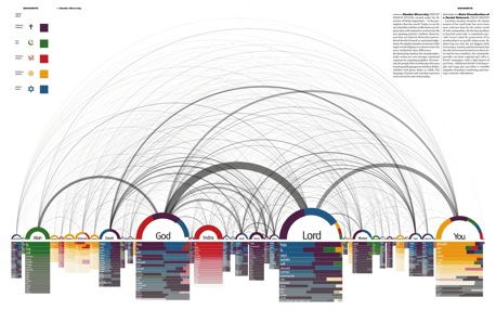
For me the Datanets are beautiful, but perhaps the most obvious ways of displaying data. All those arcs and webs are something that Processing does very well and a lot of the projects have used Processing’s ability to make visual sense of large amounts of data.
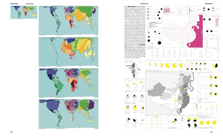
My favourites are the Datascapes and Datology sections because of the more human aspect to them (and I think conjure up those childhood memories of being fascinated by books like this). I loved the clear yet detailed infographics by Funnel Inc., for example, and Dave Bowker’s use of colour and type in his One Week of the Guardian series to name but two.
Frankly, there wasn’t much I didn’t love and I could go on listing favourites for ages. All the contributor and URLs are in the back of the book, so I promptly spent even more time checking them out. (Anyone who already has or is in the book, feel free to add your links in the comments).
The captions are long enough to be informative, although a little mixed, depending on who wrote them I imagine. The foreword by Ferdi van Heerden and introductions to each chapter, however, lead really well into the content and the interesting interviews dotted throughout the book.
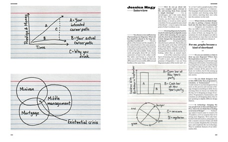
The interview with Indexed’s Jessica Hagy is particularly good. Given the recent apostrophe debate, this quote from her jumped out at me:
The grammar of math is more open ended than the grammar of linguistics. I can use Venn diagrams in place of the words ‘and’, ‘or’, ‘is’, or ‘isn’t’ and x-y graphs in place of the words ‘causes’, ‘influences’, or ‘relates to’. The language of math means that readers can translate each drawing using their own rubrics, inserting their own verbs into the sentence on the card.
Hagy’s hand-drawn index cards are one of several examples of hand-drawn data visualisations and infographics and this highlights a paradox of the book.
On the one hand, it feels deeply pleasant to hold some of these normally screen-based data visualisations in your hands, lovingly printed and bound.
On the other, I found myself looking over the top of my glasses at the tiny type in some of the images even though they are full-page. Some just have so much data in there and I wanted to interact, zoom in and manipulate it all as screen-based experience.
Either that or have a huge poster printed of them like Brendan Dawes’s Cinema Redux, which I was expecting to be in Data Flow actually (but you can buy your own limited edition one over at Coudal!).
I can only recommend this book in the highest, it’s another cracker from Gestalten (who also have an interview with co-editors Nicolas Bourquin and Thibaud Tissot on Gestalten.TV). It’s the kind of book you really can leave on your coffee table and always find something new in it time and time again.
Incidentally, if you are a fan of this kind of data visualisation you should check out the Information Aesthetics and Cool Infographics blogs.
Book credits: Data Flow was edited by Gestalten’s Robert Klanten and Sven Ehmann and Onlab’s Nicolas Bourquin and Thibaud Tissot (who also designed it) with text editing and Foreword by IDEO’s Ferdi van Heerden.
Buy Data Flow from Amazon.com
