

Type on Screen: 5 Questions with the Author
As a design educator, I find that there is a constant uphill battle to get students an ever increasing amount of information in a continually shrinking amount of time. Ellen Lupton’s previous books, including Thinking With Type and Graphic Design: The New Basics, have proven invaluable resources in this continued endeavor. Her latest book Type On Screen is yet another strong resource which provides a thorough overview of everything related to typography in the digital realm in a succinct and easily comprehendible manner. I recently asked her five questions about the book in order to learn more about its creation, purpose and intent.
What made you decide to publish a book strictly focused on the digital world of type in a traditional printed format?
A printed book has unique affordances. People can flip around through the pages, quickly scanning for content that interests them. In contrast, the linear stream of an ebook can be rather disorienting. You can’t move around nearly as easily, and it’s hard to know where you are. A printed book allows for the collection and display of visual examples in a more focused and compelling fashion. There are many great print books about digital design out there, such as those published by our friends at A Book Apart, that take advantage of both the writerly possibilities of print and the convenience of a having a stable little guide that you can hold in your hands and come back to. That said, Princeton Architectural Press is working on digital editions of Type on Screen (epub and PDF), and these will be valuable to. As a user, I enjoy having books in multiple formats.
The book covers all of the basics a designer would need in the current digital world, and much more. You also offer some excellent perspective on the historical evolution of type on screen. What, if anything, did you have to leave out of the book?
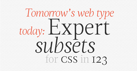
Type on Screen was written with a team of outstanding Graphic Design MFA students at MICA, who each brought multiple modes of expertise to the project, including web design, interaction design, digital publishing, animation, and more. We set out to create an introductory guide to working with type on screen. It’s not a book for experts, and it’s not a software manual. We didn’t go into deep technical detail about how to implement CSS or how to write programs in Processing or how the different web font services work. That information is changing quickly, and there are plenty of places to learn about specific techniques. This book is more about ideas and concepts. We collected many inspiring visual examples, which are key for getting people excited about what is possible.
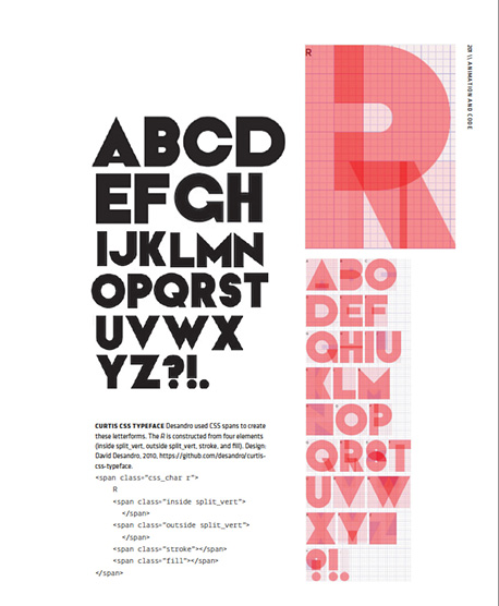
Your inclusion of HTML and CSS references is a nice way for designers to begin to become familiar with the language of front-end development. How important is it for modern designers working in the digital medium to also be able to write code and implement their designs?
I don’t see how anyone can design a web site without basic knowledge of HTML and CSS. These tools are the building blocks of organizing content for the digital world, and they have remarkable structural similarities with other ways that we create visual order and hierarchy. The difference lies in the more rigorously systematic nature of type on screen. Some designers will go much deeper than this, but our book provides an inviting way in.
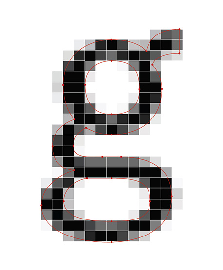
How do you see things like retina screens and higher resolutions affecting the world of digital type in the future? Will the pixel ever cease to exist as we know it?
Everyone in the web world wishes there was a universal standard for screen resolutions and browser support. Alas, that’s not the case, and it may never be. Til then, designers will have to keep dealing with the pesky behavior of pixels and the way type designs translate across different digital environments. Settling on a standard too quickly would probably be a disaster anyway. You need to have a lot of innovation and variety in the early years of a new medium.
Are you already planning a follow up book or a revised edition? How quickly do you think the evolution of technology will require an update to or replacement of information contained in the book?
Yep, we are already making revisions to Type on Screen. A few changes will turn up in our digital editions. Printed books actually change a lot more than you think. Editors and authors are always collecting corrections and new content and references. Print editions are relatively small, allowing for updates along the way. For example. we’ve been working with type critic Stephen Coles to add some more great typefaces to our list of recommended fonts for the web. We see Type on Screen as a work in progress.
Type on Screen is published by Princeton Architectural Press and is available from Amazon (US | UK).
About the Author
Ellen Lupton is curator of contemporary design at Cooper-Hewitt, National Design Museum in New York City and director of the Graphic Design MFA program at Maryland Institute College of Art (MICA) in Baltimore. An author of numerous books and articles on design, she is a public-minded critic, frequent lecturer, and AIGA Gold Medalist.
About the Reviewer
Dominic Flask is a designer by nature, a teacher by application and a thoughtful companion by friendship. You can view his design portfolio here and his in-progress work on Dribbble.