

Looking at Type: A Pictorial Review of Four Type Reference Books
Photographed and Reviewed by Carolina de Bartolo
How many type reference books do you need in your library? If you love looking at letters like I do, I’d say the more the merrier. Stock up! Sure, I’ve heard about that whole digital revolution thing, but when it comes to looking at great type, the higher the resolution the greater the eye-candy effect. And even the latest retina screen is nowhere near the resolution of good ol’ ink on paper.
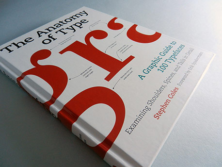
Cover of The Anatomy of Type: A Graphic Guide to 100 Typefaces by Stephen Coles, with a foreword by Erik Spiekermann, published in 2012 by Harper Design.
A (superfluous) dust jacket of exactly the same design has been removed and discarded. Sorry!
From The Anatomy of Type, the requisite typographic anatomy diagrams.
No surprise considering the aforementioned title.
From The Anatomy of Type, convenient reference for how to use the book.
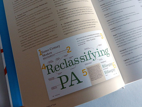
In addition to the typeface information and samples, each spread includes a nifty cross-reference for related faces in the lower right corner. Facing page here is a basic glossary of terms. And we’re just getting started.
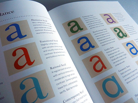
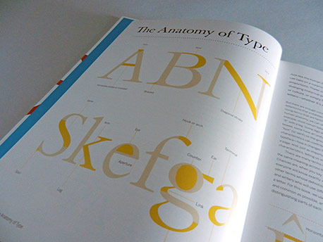
From The Anatomy of Type, type classifications.
While this extensive system of classifying type certainly has its merits, I’m afraid beginners will find it a bit rarified and intimidating. Delineating groups of subclassifications would probably benefit the newbies.
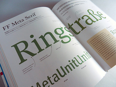
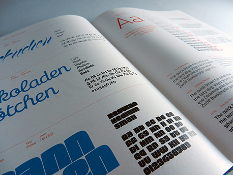
From The Anatomy of Type, sample spread for FF Meta Serif.
A carefully chosen word is set in a triple-digit point size and straddles each spread to give you a macro view of the type’s features.
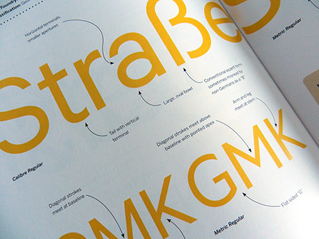
From The Anatomy of Type, Calibre spread, detail.
The oversized sample letterforms allow every characteristic of each typeface to be beautifully noted with an abundance of playful swooping arrows.
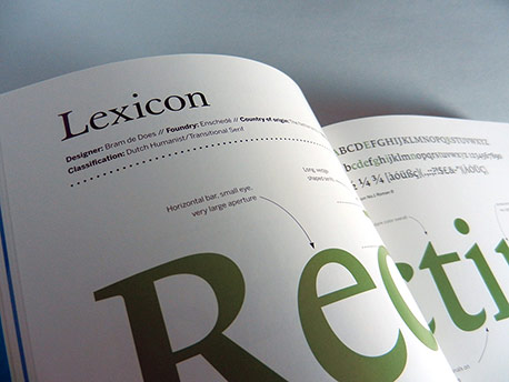
From The Anatomy of Type, Lexicon spread, detail.
Each page begins with precise design details such as the designer, foundry, year of design, etc. You’ll want to memorize this stuff, right?
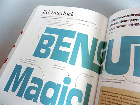
From The Anatomy of Type, Ed Interlock spread, from the “Display” chapter.
Color variations from page to page make leafing through the book a very pleasant experience.
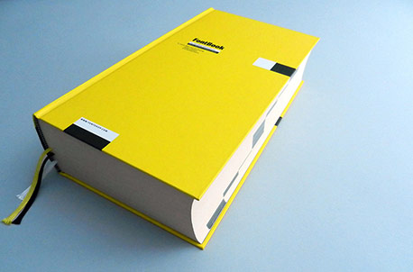
Cover of FontBook, published by FontShop International.
The FontBook app has understandably replaced this massive volume, which is sadly no longer in print.
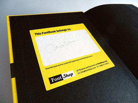
From FontBook, the bookplate on black endsheets.
The warning reads: “Steal this book and be cursed with papercuts and Postscript errors.” A humorous little touch.
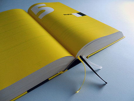
From FontBook, chapter 5 opening spread.
Note the 3 ribbon bookmarks. You’ll need them if you are lucky enough to have this invaluable reference.
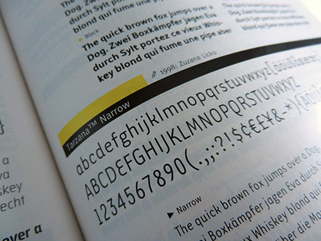
From FontBook, detail of the Tarzana Narrow entry.
Each typeface is shown with a full character set in the parent weight. Below that, pangrams are set in all the different weights of the face. To the left of the pangrams, related typefaces are cross-referenced under an eye icon. This much info packed into a tiny space is truly a remarkable achievement of design.
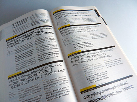
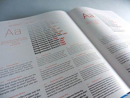
From FontBook, sample spread.
Information about the type designer and date of design is beside the name of the typeface in the black bar.
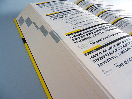
From FontBook, edge detail.
The yellow chapter openers and black bars within each chapter allow you to easily see and flip to the various sections of the book. Laying open at approximately the center of the book here, you can see why this book is lovingly referred to as the “FontBrick.”
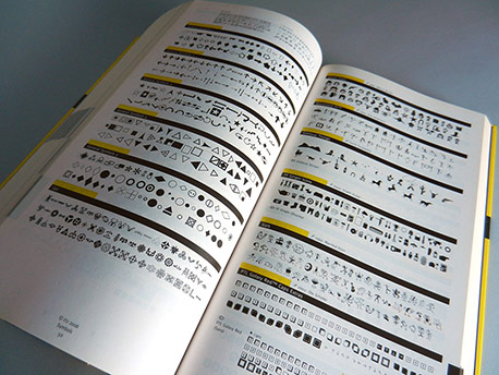
From FontBook, sample spread, Pi & Symbols chapter.
Flip to these pages for an abundance of analphabetic inspiration and ideas. If I was un- or even under-employed, I could peruse the thousands of forms of arrows in this section all the livelong day.
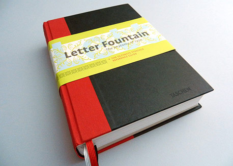
Cover of Letter Fountain: The Anatomy of Type (The Ultimate Typeface Reference Guide), by Joep Pohlen, published by Taschen.
The fourth edition of this compendium is a 2010 red dot design award and TDC winner. At 640 pages, there is not much left out of this baby.
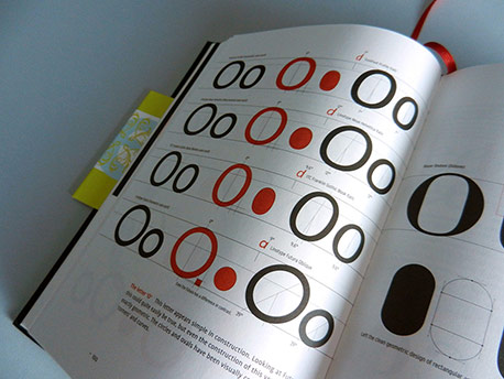
From Letter Fountain, comparison of the letter O in four sans serif typefaces.
Diagrams like this help us know the angle of stress in Linotype Helvetica Neue Italic is 12º. And, by comparison, what is it in Linotyope Futura Oblique, you ask? A whopping 39º. Boo on you, Futura Oblique.
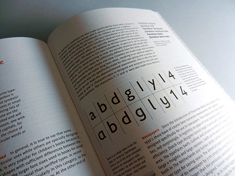
From Letter Fountain, page detail.
The impressive breadth of content ranges from the prehistoric origins of writing to this “Choosing a Typeface” section. An extensive historical timeline of typographic events from Gutenberg to the present includes contemporaneous developments in painting. Study this and you are sure to be amongst the most popular typophiles at any party.
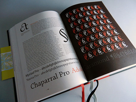
From Letter Fountain, spread for Chaparral Pro.
With so much information, this could have been an ordinary monotonous textbook, but the drama of a full bleed black gives the page sequence an occasional pop. In book design as in writing, above all, do not bore the reader.
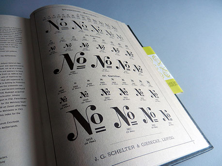
From Letter Fountain, reproduction of a lovely 1886 type specimen of “No.” characters from J.G. Schelter & Giesecke.
The sizable appendices are printed on a laid brown-paperbag-colored stock which sets these sections apart rather distinctly.
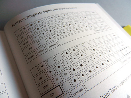
From Letter Fountain, keyboard layout detail.
All the dingbat fonts referenced in the book include these handy keyboard layout references.
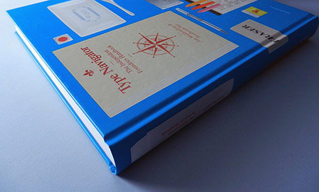
Cover of Type Navigator (The Independent Foundries Handbook), by Jan Middendorp and TwoPoints.net, published by Gestalten.
At 9-by-12 inches, this is the largest format of the four books reviewed here. A standard textbook binding makes it a solid, sturdy edition.
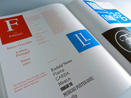
From Type Navigator, chapter opener.
Organized by foundry, each chapter begins with a quote from the foundry’s type designer/s in response to the question: “Why?”. Those big red and blue squares have me asking “why?” as well. More on that later…
From Type Navigator, spread showing display type samples in blue and text type samples in red.
While I admire many Gestalten publications, I found the “red, white and blue” color scheme in this book somewhat disappointing. Red and black alone would have been a simpler and more elegant book design.
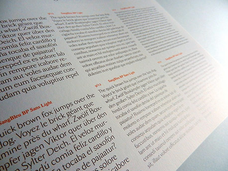
From Type Navigator, text type sample spread.
Each of the text type pages shows the featured face in all its weights at display sizes as well as in short paragraphs set at 12/14, 9/12 and 7/10. (Note how much nicer the book looks when you just see the black and red.)
From Type Navigator, detail of text type specimen for Sang Bleu All text block samples are shown in three sizes and three or four weights.
Highlighting a diverse group of underused but excellent faces, the book functions as a full-scale and much needed “Cure for the Common Font.”
From Type Navigator, type in use sample.
This swirly handlettering was created for a magazine layout and is based on the typeface Mommie by Hubert Jocham. Including the type in use images seems like it might have been an after-thought, but their intermittent appearance provides a bit of visual relief from the somewhat uninspired book design.
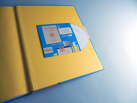
From Type Navigator, inside back cover, CD insert.
Yes, you’re seeing that right, a book published in 2011 includes a CD (!) of free fonts. Whether you are laughing or crying right now, fear not, the fonts on the CD are mostly garbage…as free fonts on a compact disc would tend to be. Clearly a lame marketing ploy aimed at the typographically challenged.
(Click to enlarge)
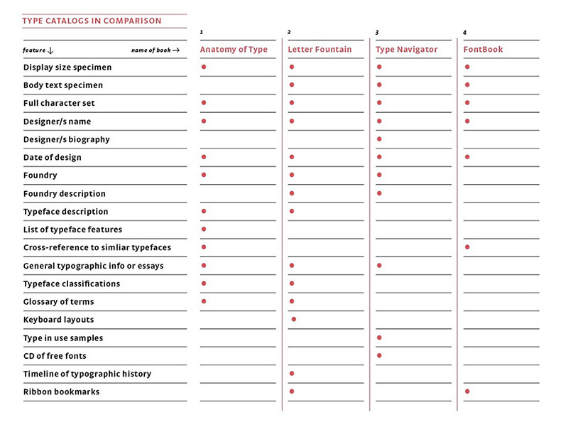
Compare and contrast these four type reference books, and find the one/s that are right for you.
The Anatomy of Type is published by Harper Design in the US and by Thames & Hudson in the UK. It is available at Amazon.com (US | UK).
FontBook is published by FontShop and the print version is available used at Amazon.com (US | UK).
Letter Fountain is published by Taschen and is available at Amazon.com (US | UK).
Type Navigator is published by Gestalten and is available at Amazon.com (US | UK).
Carolina de Bartolo teaches typography and design history in San Francisco. She is the designer, author and publisher of the popular typography textbook, Explorations in Typography: Mastering the Art of Fine Typesetting, which is now available as an interactive digital book inside the book’s companion app.