

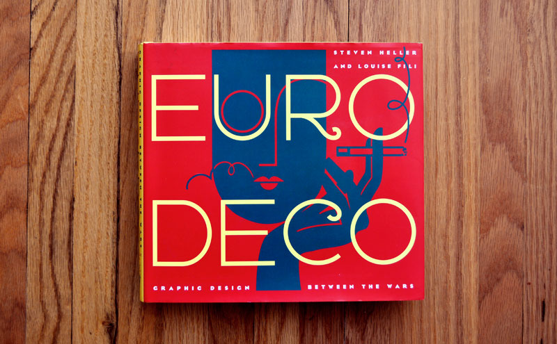
Euro Deco: Graphic Design Between the Wars
(Click to enlarge)
My initial reaction to the book Euro Deco: Graphic Design Between the Wars was disappointment. But it wasn’t because of the book itself, it was because of my own ignorance. On a previous book buying escapade I managed to track down all eight of the books in the Chronicle series on Art Deco design, which include Dutch Moderne, British Modern, Deco España, Italian Art Deco, German Modern, Streamline: American Art Deco, French Modern, and Japanese Modern. I even bought the companion book, Deco Type: Stylish Alphabets of the ’20s and ’30s.
I then purchased Euro Deco expecting a culmination of the series covering the range of developments across Europe during the period. When I received it, I was dismayed to learn that it is actually a reprint of six of the eight books, excluding the texts on Japanese and American Art Deco. Admittedly, it was my own fault for not carefully reading the description on Amazon. I finally managed to recover from my stupidity and ended up thoroughly enjoying the book.
(Click to enlarge)
While the six books have been condensed to almost half of their original content, they are nicely organized in an order that makes sense when reading through them. It starts with French Modern ends with British Modern, which makes sense because the French were the pioneers of the style and the British were the last to adopt it. Also included is an insightful introduction from the authors, Steven Heller and Louise Fili, which gives a very detailed description about the development of Art Deco. The authors are experts on the period and I found the details of the history behind the development enthralling.
Art Deco may have gone out of fashion, but it’s not out of style. Introduced in the early twenties to insure French hegemony as the producer of postwar European decorative art and adopted by dozens of nations thereafter, this marriage of modern and modernistic continues to attract aficionados.
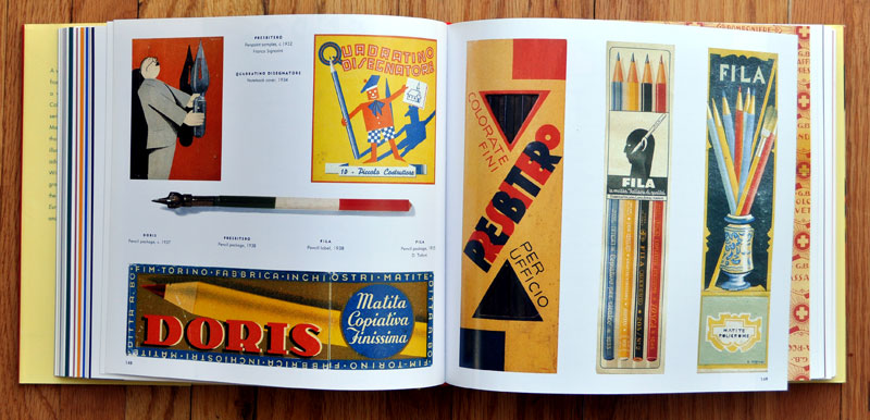
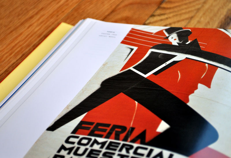
The books are all divided into chapters, each chapter covering a specific area to which the style applied. The areas differ slightly between the separate books, but many are similar. Among the topics covered are Industry, Commerce, Food & Drink, Beauty & Cosmetics, Culture, Fashion, and Typography. Each book also has a lengthy introduction describing the evolution of the style in the particular country the book features.
(Click to enlarge)
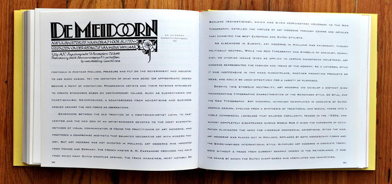
While the introductions are quite nice, many of them overlap and are repetitive. This is, of course, because the style of Art Deco developed and became popular for many of the same reasons regardless of the country the particular book features. The overlap is also due to the fact that the books were originally published separately. I am quite positive that if I was just reading one of the books I would have enjoyed the detail and found it quite applicable, but after the sixth one it was somewhat redundant.
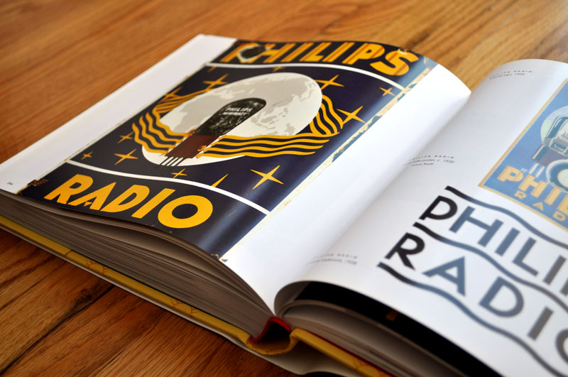
The imagery in the books is laid out consistently and with enough variation to keep things interesting. The amount, and variety, of images is quite impressive (the book weighs in at 500 pages and only about 120 pages of text). However, there were two things that consistently bugged me about the design and they were both with the layout of the text.
First of all the book is wide in its proportions and all of the text is set to run the full width of the page. Personally, this is way too long for a line of text and it made reading through the text-heavy parts painful and slow. Along with the line-length, the typographic selections for the text made it exceedingly difficult to read quickly. Each book has a different primary typeface and each typeface is characteristic of the Art Deco style. What you don’t find anywhere in this book are references of the Art Deco style as applied to book design, and I believe this is exactly why. Art Deco typography makes for great display type, but impairs reading when it comes to text type. While the typefaces that were selected are acceptable text faces, I managed to make it through almost the entire book in one setting with no major occurrences of headaches, none of them are ideal for blocks of text this large.
(Click to enlarge)
In the end the positives far outweigh the negatives and the book is more than worth the price tag it carries. The amount of imagery is mouth-watering and the accompanying information is poignant and insightful. It serves as a great alternative to trying to track down the individual books, even though the additional content in them is a nice thing to have. In the end it more than served its purpose and the content was thoroughly educational.
(Click to enlarge)
Euro Deco: Graphic Design Between the Wars is published by Chronicle Books and is available from Amazon (US|CA|UK|DE).
About the Reviewer Dominic Flask is a designer by nature, a teacher by application and a thoughtful companion by friendship. You can find his work here, his thoughts here, and his passion on Design is History.