

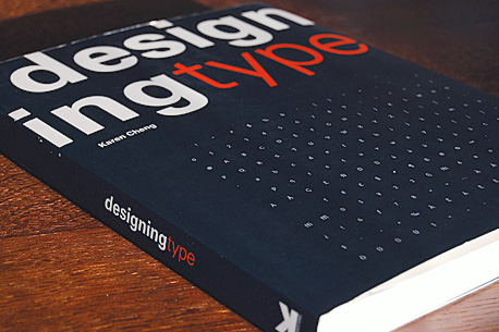
Designing Type
Karen Cheng’s Designing Type is the answer to the needs of a multitude of type designers from all over the world. It is probably the first book ever to analyse, discuss and explain process of designing letterforms so thoroughly. This rather big (232 pages, 28x22cm) imprint is from the very beginning to the very end filled with useful, sometimes extremely detailed, but always very practical guidelines, tips and rules concerning designing your own text font from the scratch. All this is beautifully illustrated with hundreds of examples explaining even the most complex typographic issues.
This amazing book will be useful for design students, independent freelancers as for experienced teachers. However, it is not a book for everyone. There are plenty of designers and typographers who are never going to design their own text typeface. For them Designing Type is probably not a must-have and they would be happy with some book about typesetting (like Jost Hochuli’s Detail in Typography or Robert Bringhurst’s Elements of Typographic Style). But everyone who seriously thinks about designing fonts will surely find it irreplaceable.
But first, let me introduce the author to those who may not know the name of Karen Cheng. She is an associate professor in the Visual Communication Design program at the University of Washington in Seattle, and knows what she’s writing about. What is even better, although she is a professor also, you won’t find a lot of theoretical debate in this book. It is mostly very practical and straightforward problem solving, with just enough touch of her personal reflections on type.
The book is divided into nine main chapters that reflect the key elements of type:
- Introduction
- Serif Capitals
- Serif Lower Case
- Sans Serif Capitals
- Sans Serif Lower Case
- Numbers
- Punctuation
- Diacritical Marks
- Spacing
This division enables the user of this book to get back to it whenever necessary and quickly find the information needed. “User” of the book? Yes, this book is not only made for reading once, but one that should be used again and again during type design process. I guarantee you won’t even remember the most crucial rules after just one reading.
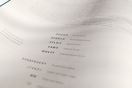
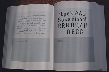
The Introduction is the shortest part of the book and at the same time it contains the greatest number of words. It gives an insight into the design process, explains variables and parts of letters and provides a short history and classification of the typefaces. Nothing too fancy and most of the people already experienced in designing fonts will know all this already, but it’s a nice thing to start with and a great reminder of the theory.
“There is no single, ‘correct’ process for creating a typeface. […] In some ways,the most difficult part of the design process is finding the initial inspiration to make a font. The vast number of existing typefaces (last estimated at 50-60,000 in 1996) can be intimidating. […] Still, the ongoing proliferation of type shows no sign of abatement; if anything, the complexity of the modern world encourages continued growth.”
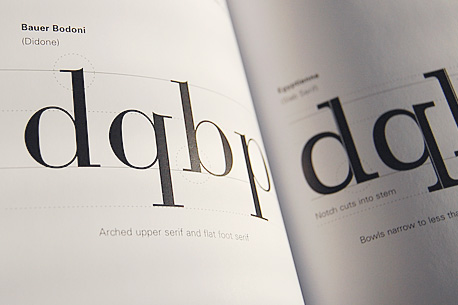
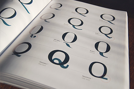
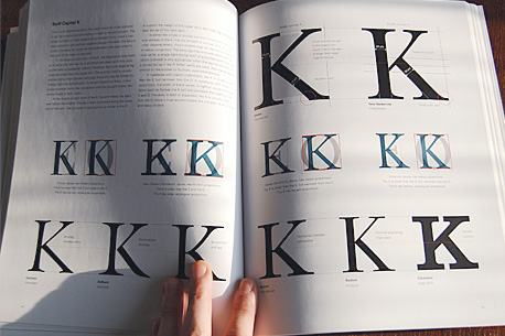
The Serif Capitals section, naturally, explains thoroughly how to design text serif upper case letters. It gives you the overall advice on letter shapes and quite often explains in detail particular elements. The letters are in the order of the author’s design process, so the reader can actually feel the alphabet growing with every page. It is very logical and deliberate and a useful sequence to follow when designing fonts.
Serif Lower Case is also set in its own order, which encourages the reader to smoothly follow the design process. Here also comes my favourite example of Karen’s personal insight in the book and her very personal attitude towards letterforms.
“The lower case g is one of the most beautiful letters in the roman alphabet. The double storied form is rich with single and compound curves, creating a complex shape that is free and organic, yet structured and intelligent. It is these contrasting qualities that give the g its unique and expressive personality.”
It ends with examples of Karen’s students’ serif type designs, which are especially enlightening, as seeing mistakes is one of the best way to learn how to avoid them.
Then the same division goes for the sans serif fonts which are explained in the same manner and just as thoroughly as serif fonts. It also ends with students’ designs, which are very inspirational to look at – not only for type designers.
Out of the Numbers, Punctuation and Diacritical Marks chapters, the only part that may disappoint the reader slightly are diacritical marks. This part only covers the most important diacritics of the Western European countries: acute, grave, circumflex, diaeresis, tilde and cedilla, while it leaves out many other diacritics: breve, caron and – to my regret – polish ogonek. This is understandable, however, as most of the fonts nowadays don’t even contain these ‘rare’ diacritics, but I hope it’ll be supplemented in the next edition.
The last part, Spacing analyses and addresses problems of spacing and kerning. It is a great base and provides the reader with the most basic rules and even a list of the most common kerning pairs, but it certainly wouldn’t hurt if a little more space (no pun intended) was devoted to these issues. This chapter may leave the reader with hunger for more, especially given that it is the last part of the book.
All in all, Cheng’s Designing Type is for type designers what Bringhurst’s Elements of Typographic Style is for all typographers – the Bible. I can’t imagine ever designing a text font without Karen’s manual by my side. Just in case.
Karen Cheng’s Designing Type is published by Yale University Press and available from Amazon (USA|UK|CA|DE) or the Designer’s Review of Books Amazon Store.
About the Reviewer
Filip Łysyszyn is a young, self-taught graphic and type designer based in Warsaw, Poland and you probably are not able to say his last name right, but that’s OK with him. He’ll be happy if you check out his work at www.filip.lysyszyn.pl