Victor & Susie

by Editor on February 11, 2009

in 2D

victor_susie_cover.jpg

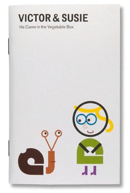
Brighten the Corners sent me a copy of their very cute book, Victor & Susie. It is a short story book about a girl, Susie, who meets a snail called Victor that has a hole in his shell and isn’t feeling too well. She takes him in and looks after him and… well, I don’t want to spoil the ending for you.

victor_susie_02_thumb.jpg

(Click to enlarge)

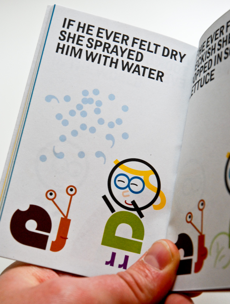
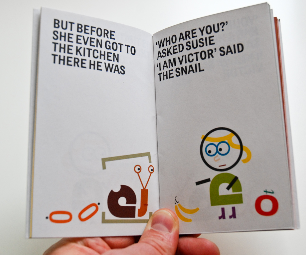
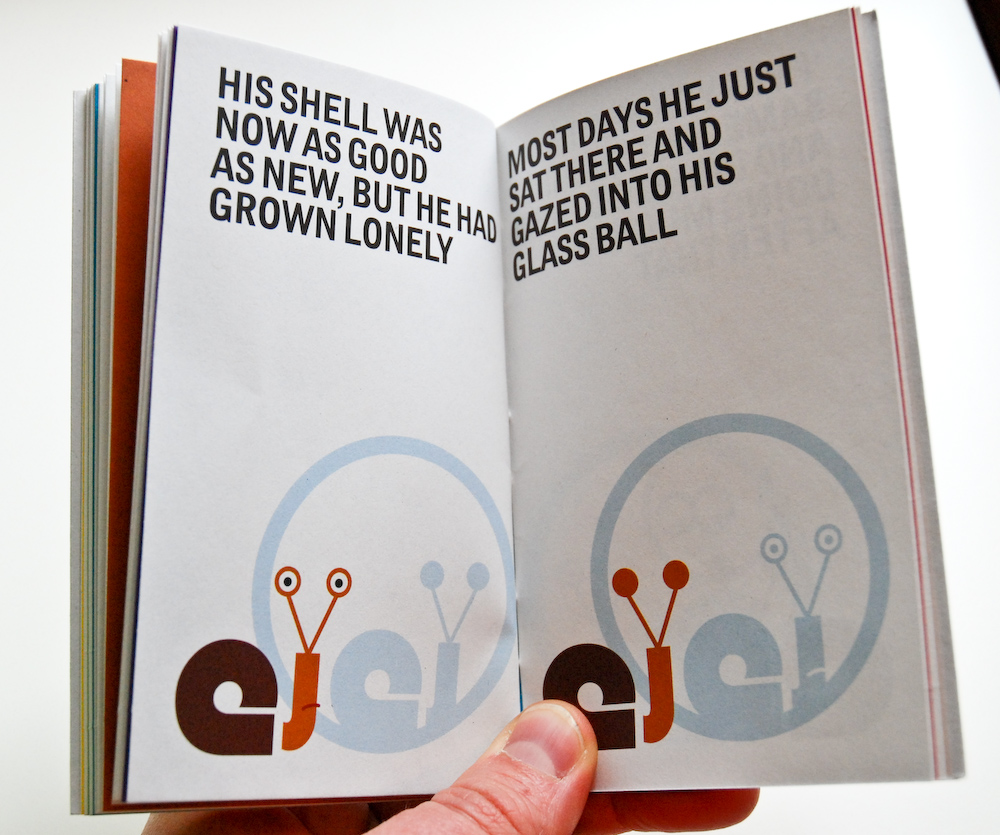
The credits list Brighten the Corners’ partners Billy Kiossoglou as the Writer and Illustrator and Frank Philippin as the Typographer. Given that the real feature of book is that all the images are created typographically, I’m not quite sure how they divided that up.

victor_susie_03_thumb.jpg

(Click to enlarge)

What to say? It’s not big, but it is clever. And it is a cute story. I was surprised how small the book was physically – I had not noticed the dimensions online – but it only costs £5 so you can’t really complain. My immediate thought, however, was that I would love to see it bigger and printed on that heavy card used for children’s books.

victor_susie_04_thumb.jpg

(Click to enlarge)

If you want a little gift for your favourite typographer or typographess it’s not a bad idea. Or start indoctrinating your children into the world of type at an early age, but buy two copies because they will get one grubby. Getting them to wear white cotton gloves might just be a bit too extreme – save them for photographer’s kids.

Rating: ★★★½☆ 

You can buy Victor & Susie directly from the Brighten the Corners website.

Share this:
  • TwitThis
  • Digg
  • StumbleUpon
  • del.icio.us
  • Facebook
  • Tumblr
  • Google Bookmarks
  • email
  • Ping.fm
  • Reddit

Possibly related posts:

  1. Stanley & Marvin If you liked Victor & Susie, the short, small...
  2. Winner of For The Love of Vinyl Competition The For The Love of Vinyl competition has a winner....
  3. Imposters Hollywood Boulevard is filled with people dressed us famous...
  4. The Advertising Concept Book What makes a good ad? What makes an award-winning...
  5. Daniel Eatock – Imprint I have been wanting to write the review of...

{ 1 comment… read it below or add one }

1 Alex Charchar February 12, 2009 at 11:44 am

haha, so cute! Illustrations made up of type often feel like the designer was trying a little too hard to show how clever they were.. in this case I think they hit it just about right.. The second image (“if he ever felt dry…” is fantastic.. thanks for sharing

Alex Charchar’s last blog post..Art Director: Milton Glaser

Leave a Comment

You can use these HTML tags and attributes: <a href="" title=""> <abbr title=""> <acronym title=""> <b> <blockquote cite=""> <cite> <code> <del datetime=""> <em> <i> <q cite=""> <strike> <strong>

Your e-mail address is never shared or published. We hate spam too.