

Uncredited: Graphic Design & Opening Titles in Movies
Before motion graphics there was broadcast graphic design and before that title design for film. It is a vibrant area of design that has remained strangely undocumented. Most designers will know of the legendary Saul Bass, but many other title designers remain unknown.
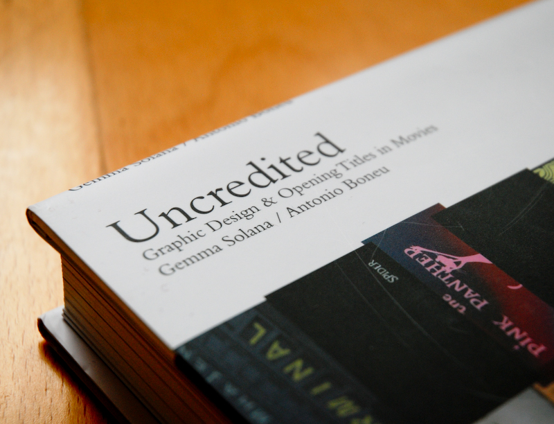
Uncredited: Graphic Design & Opening Titles in Movies by Gemma Solana and Antonio Boneu, published by Index Book, lays claim to being “the first book to give a general and historic insight into the role which graphic design plays in films”. The name of the book is taken from the early days of cinema when title designers remained uncredited often up until the 1970s.
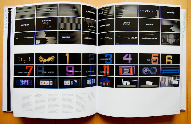
(Click to enlarge)
With such a goldmine of design classics from which to draw upon Uncredited, in the words of Marlon Brando in On the Waterfront, “could have been a contender”. Unfortunately, the book’s content is completely overshadowed by some sloppy production and translation.
As an Englishman living in Germany, I have deep respect for anyone who works in a language other than their mother tongue. I can read and write German reasonably fluently, but I would never dream of publishing a book in my own poorly-crafted German - I value the written word too much. The English version of Uncredited needed a thorough edit by a native English speaker.
The limited use of adjectives means that every other title critique is a “perfect execution from a master” and the flow of the text feels like a Google translation. It is much like riding a road racing bike up a rocky mountain path – it is possible and you can reach your destination, but it is a bumpy and unpleasant ride.
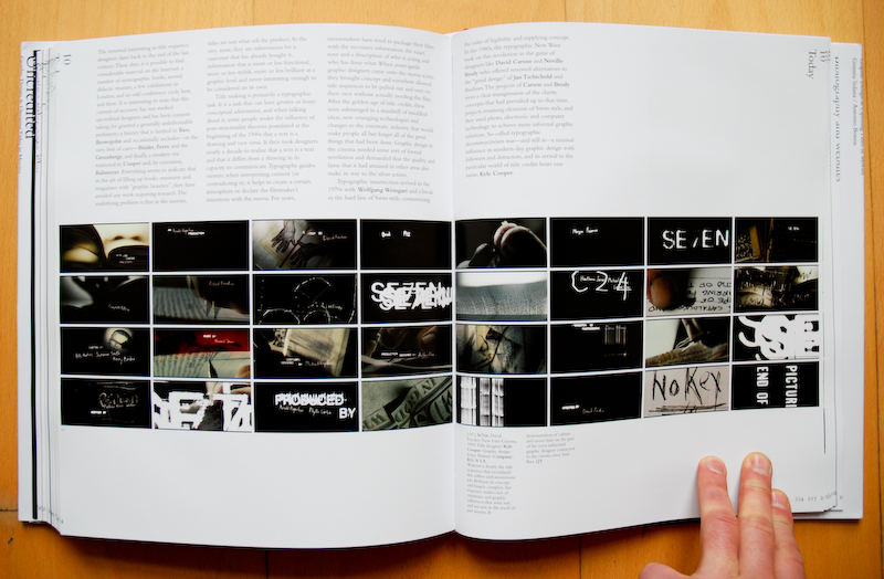
(Click to enlarge)
I would have really liked to have seen one or two decent interviews with living title designers such as Kyle Cooper, the designer of the titles for Se7en rather than quoted snippets from other interviews too. Pretty soon I found myself stopping reading and looking around at the scenery of the pictures before forcing myself back into reading the text.
The writing is such a shame, because it really gets in the way of enjoying what should have been an insightful commentary on the history of what eventually turned into the often stunning motion graphics industry we have today. I have not seen the Spanish original and have no idea if it reads as badly in Spanish, but if you can read Spanish I suspect it is the better option. I would be grateful if a Spanish reader would let us know in the comments.
The other aspect of the book that is sloppy is the physical production. It may have just been my review copy, but the titles running down the side of the pages are very tightly cropped, sometimes cropped off completely.
Other plates seemed to have slipped registrations or guillotining and occasionally the page title unforgivably runs over the top of the sequence of images. If it was an attempt at a bit of Carsonesque Ray Gun style it did not go far enough. My guess is that these are errors that should have been caught before the final print run. For a book about design, this is disappointing to see.
[UPDATE: Index Book wrote to say that, “The layout of the book was commissioned to the highly awarded, prestigious Argentinian, Barcelona-based designer Mario Eskenazi whose intention was to create a static credit sequence effect by allowing the texts to slip off the side of the pages and on top of images. It is a daring design but intentional, nevertheless.” I’m pleased that is clarified, but still feel it wasn’t nearly daring enough, laying it open to the interpretation of accidental misalignment. And running the type sloppily over the title images was ill-conceived.]
The images in the book are limited to smallish thumbnail sequences in order to show the flow and motion of the title. Given that they are film titles at film resolution, it would have been possible (though perhaps expensive) to procure a larger images to see the detail. Never mind, I thought, I shall sit back and enjoy the included DVD in all its MPEG 2 glory. Alas, the DVD is actually a DVD ROM with folders of 320px x 240px QuickTime movies. That was the end of a series of disappointments from a book that I was really looking forward to reviewing.
So, what is good about Uncredited? It is a great collection of title sequences and the authors have done a good job of searching through the archives and trying to track down the names of the original designers (and many are, indeed, uncredited).
There are many beautiful titles that I had not seen before and plenty of relatively recent ones that I had forgotten about such as Kuntzel and Deygas’s titles for Catch Me If You Can. If you can read through the lumpy writing, there is also some interesting information about the history of title design and, of course, the key designers in the area beyond Saul Bass.
However, If you actually want to view some decent images and videos of title sequences, I recommend subscribing to the (unrelated) Art of the Title Sequence web site, which I have linked to for all the titles in this review. They frequently have HD versions of the titles and sometimes added extras, such as Walter Murch talking about his sound mix for the titles of The Conversation.
Plus you can view one of the grave omissions from Uncredited – Michael Riley’s beautiful macro titles for Gattaca.
Index Book requested that readers Uncredited: Graphic Design & Opening Titles in Movies from their online store directly, but if you search in the The Designer’s Review of Books store, you might find that Amazon sell it too.